


Client: Brandnew Yespers
Project: Brand Identity, Concept Development & Purpose-Led Storytelling
Sector: Food Innovation, Sustainability, Social Impact
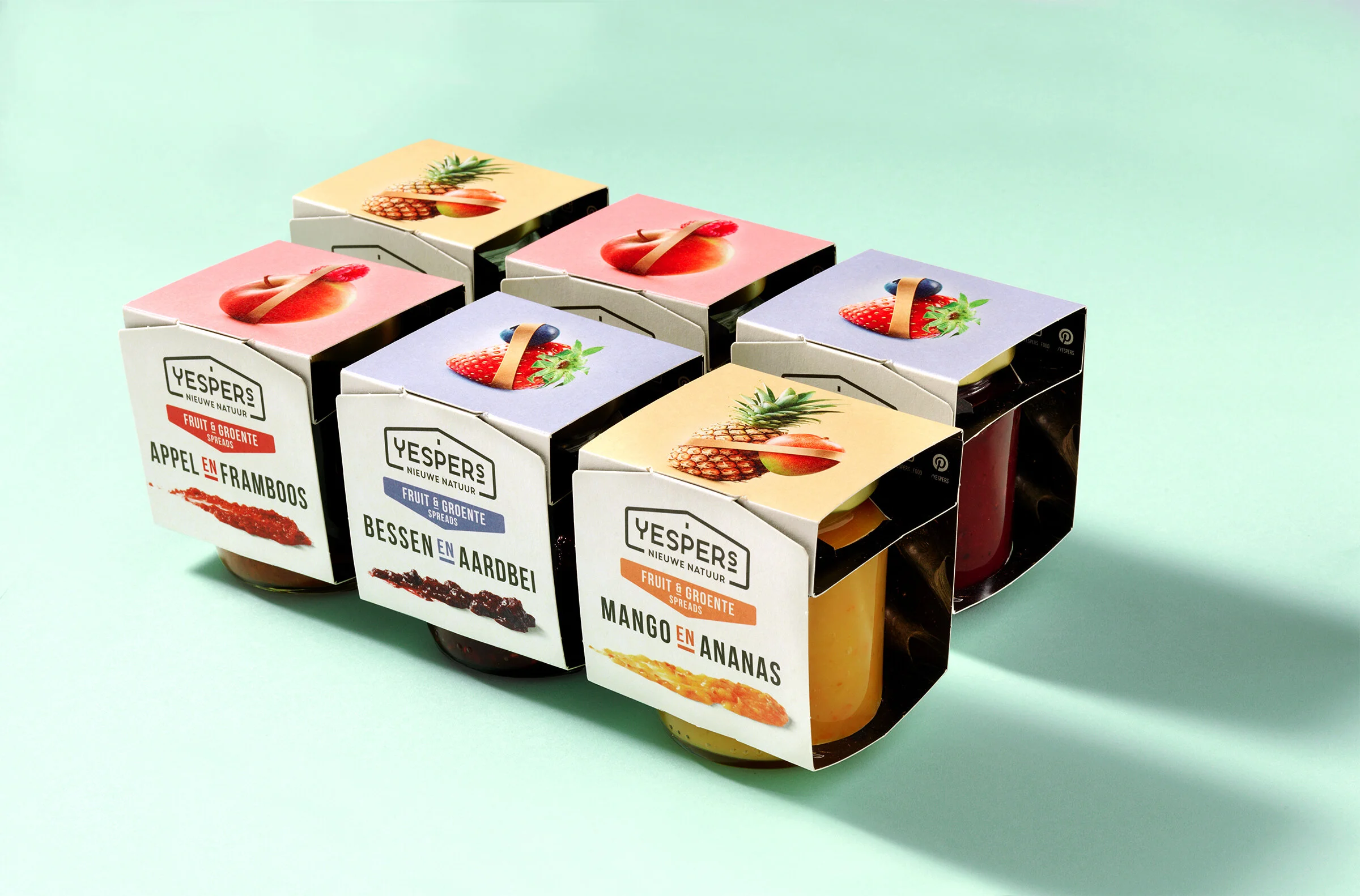
Developed in collaboration with Brandnew Design, the Yespers identity was built around a barn-inspired logo and the concept of “New Nature.” A flexible brand world symbolizing farmer collaboration, circular innovation, and social impact — recognized with a Silver ADCN Award.
Challenge
Yespers was founded with a clear mission: to reduce food waste by working directly with local farmers, turning surplus ingredients into new, high-quality products. The challenge was to develop a brand identity that captured this collaborative spirit and purpose-driven innovation — while standing out in a competitive food landscape.
Approach
In collaboration with the team at Brandnew Design, the identity concept was built around the visual metaphor of a barn — a universal symbol of agriculture, honesty, and shared effort. The logo reflects the power of community: farmers working together to transform waste into opportunity.
The tagline “New Nature” playfully suggests a shift in how we approach sustainability — blending tradition with forward-thinking innovation. An elastic band element was introduced as a recurring visual symbol: representing flexibility, unity, and the joint effort of producers to stretch value and impact further.
The brand language is both sincere and optimistic, positioning Yespers as a driver of local jobs, fairer incomes, and a more circular food system. This work was honored with a Silver ADCN Award, recognizing its creative strength and real-world impact.
Outcome
The final identity helped Yespers establish itself as a meaningful challenger brand in the sustainable food space — grounded in purpose, proud of its partnerships, and visually distinct in market. The brand’s message resonates not only with conscious consumers, but also with the broader movement toward fairer, more resilient food chains.